iContract
iContract
BRIEF
BRIEF
Create an iOS mobile app based on the existing iContract website and add some functionalities on the website.
Create an iOS mobile app based on the existing iContract website and add some functionalities on the website.
BACKGROUND
BACKGROUND
When I joined this project, there was already good progress on the visual identity and user experience of the website. I kept in touch with the in-house designer to make sure I was keeping in line with what he'd done until then.
When I joined this project, there was already good progress on the visual identity and user experience of the website. I kept in touch with the in-house designer to make sure I was keeping in line with what he'd done until then.
The product had 2 major parts: one for recruiters, one for contractors. The interfaces were similar but specific for each of these groups. We'd all meet up and have feedback sessions after each of these parts was fleshed out.
The product had 2 major parts: one for recruiters, one for contractors. The interfaces were similar but specific for each of these groups. We'd all meet up and have feedback sessions after each of these parts was fleshed out.
SOLUTION (MOBILE)
SOLUTION (MOBILE)
Contractor onboarding
Contractor onboarding
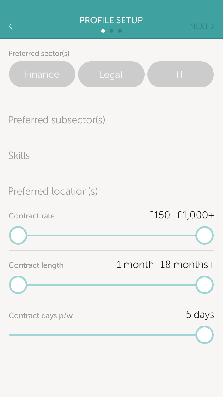
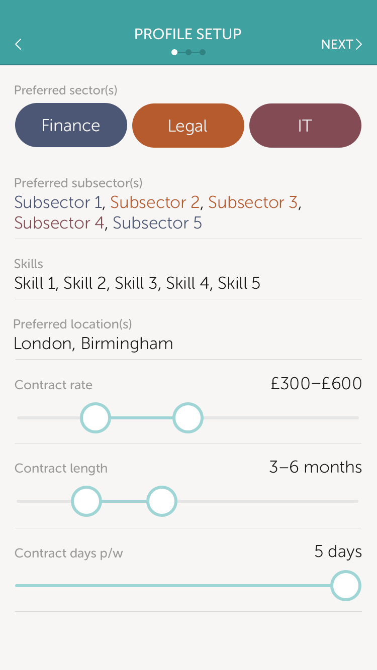
The first step to onboard a contractor was to enable them to make a list of their skills and choose where to work, how much to get paid and how much to work. The more they filled in, the more accurate the search results were.
The first step to onboard a contractor was to enable them to make a list of their skills and choose where to work, how much to get paid and how much to work. The more they filled in, the more accurate the search results were.
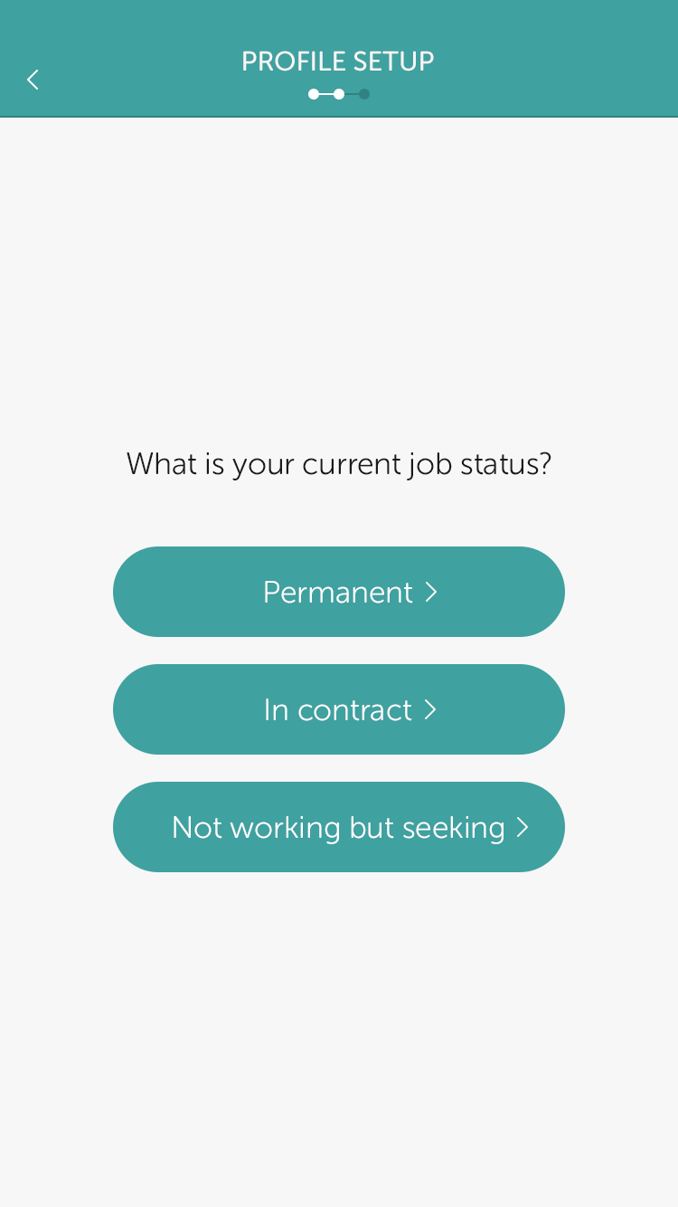
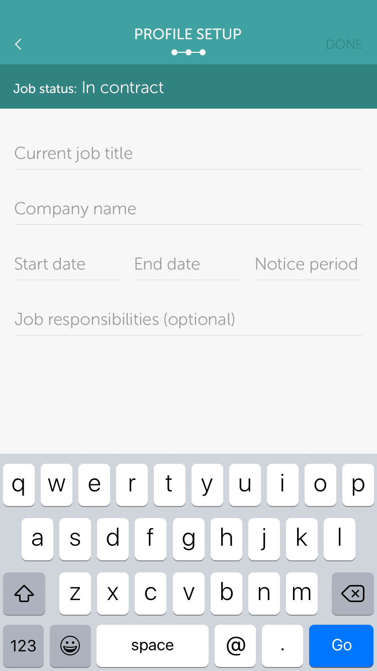
After that, they had to pick whether they wanted to go perm, find a contract or just browse. Depending on what they chose, the following form would be contextual and would help build an initial work history of the user.
After that, they had to pick whether they wanted to go perm, find a contract or just browse. Depending on what they chose, the following form would be contextual and would help build an initial work history of the user.
Recruiter onboarding
Recruiter onboarding
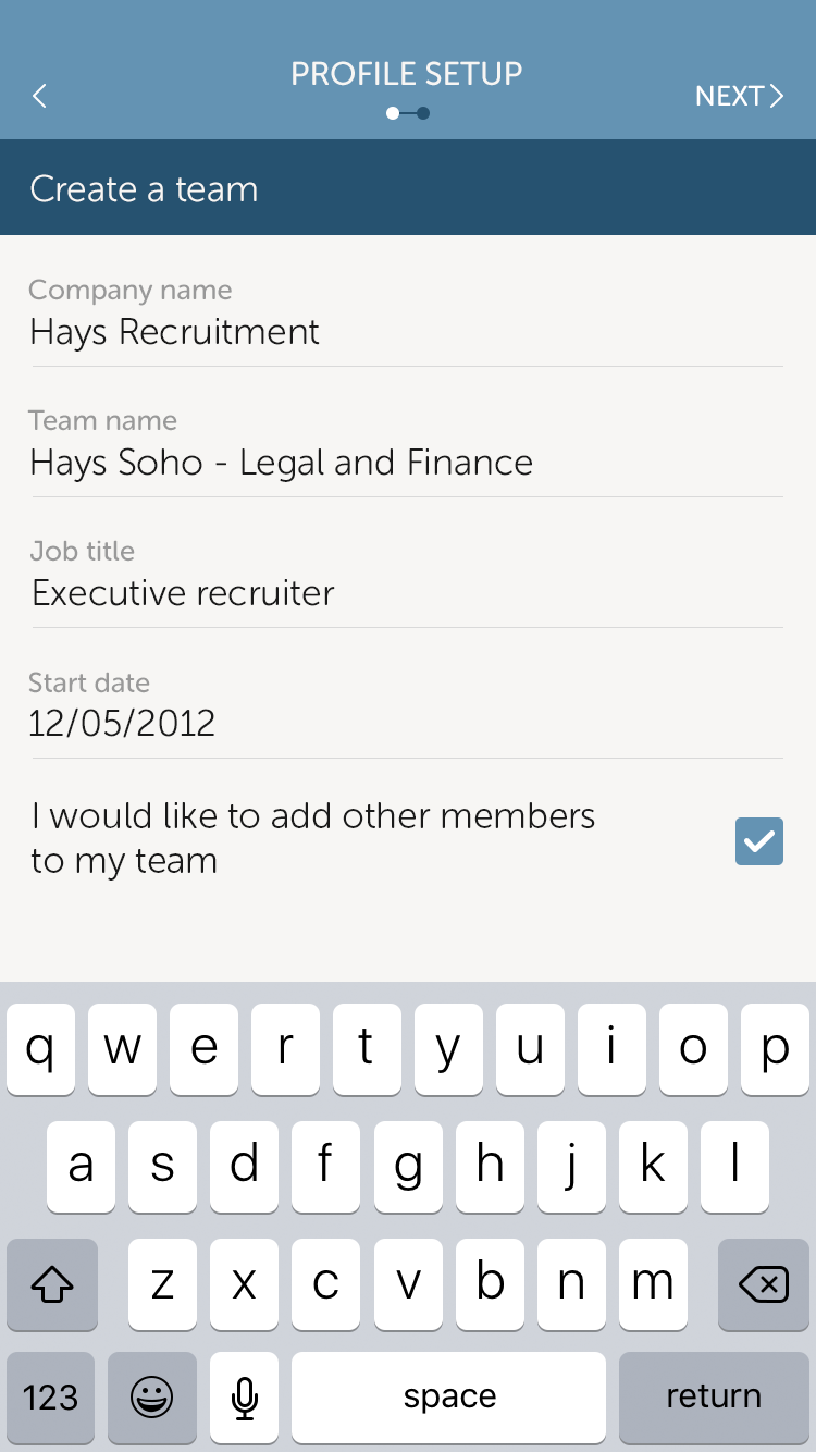
The recruiter has the choice of adding team members which, in turn, makes it easier for them when they sign in to the app, bypassing the onboarding process.
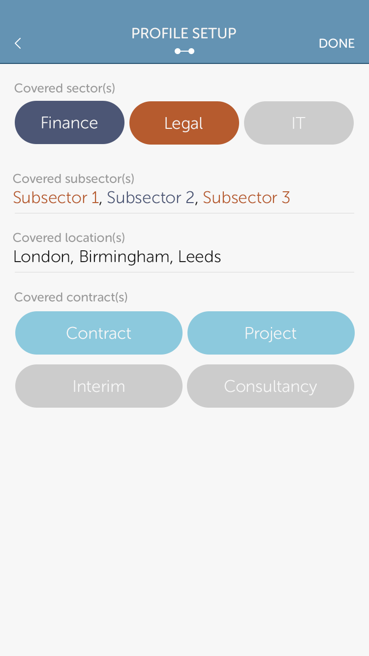
The second and final step of the onboarding process deals with covering the right sectors, locations and contracts the recruiting company deals with.
Posting jobs
Posting jobs
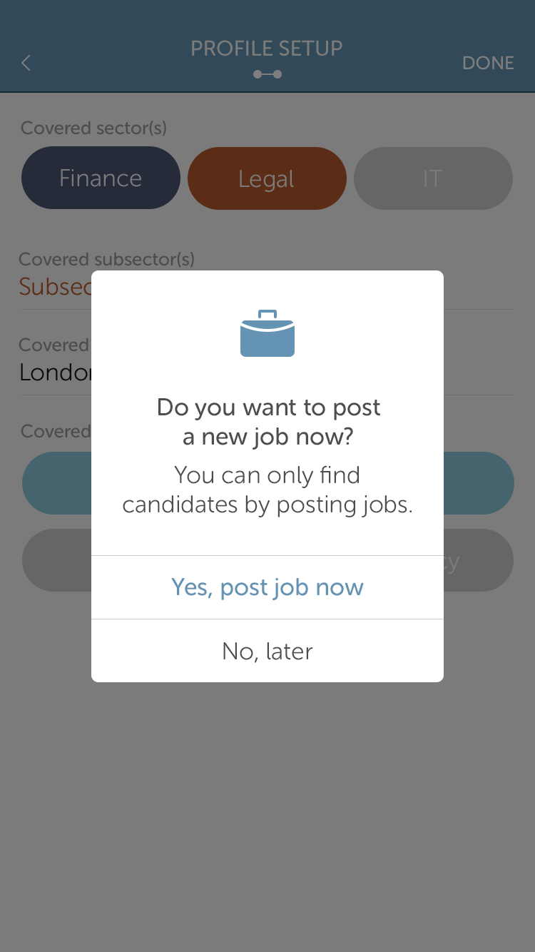
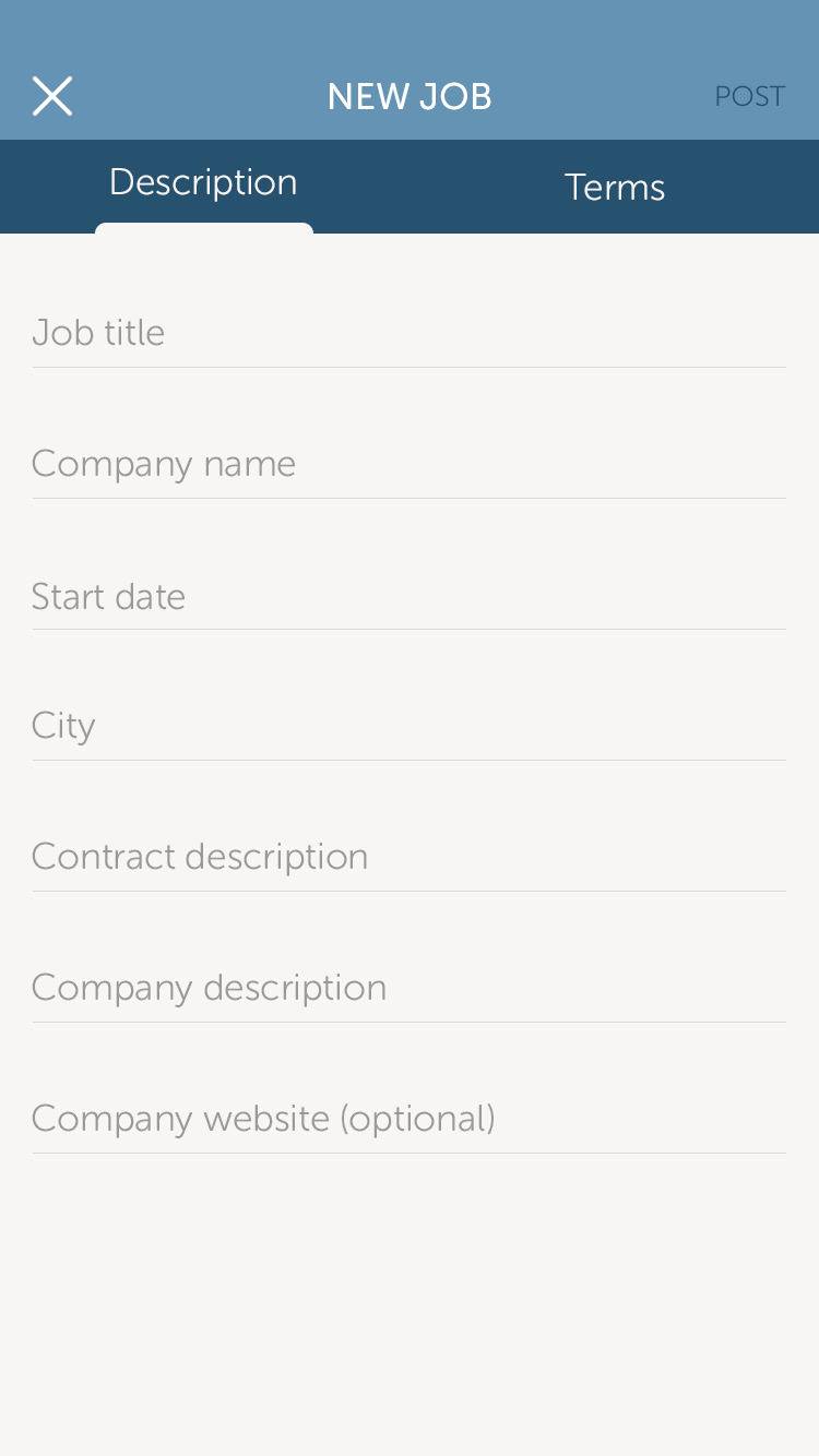
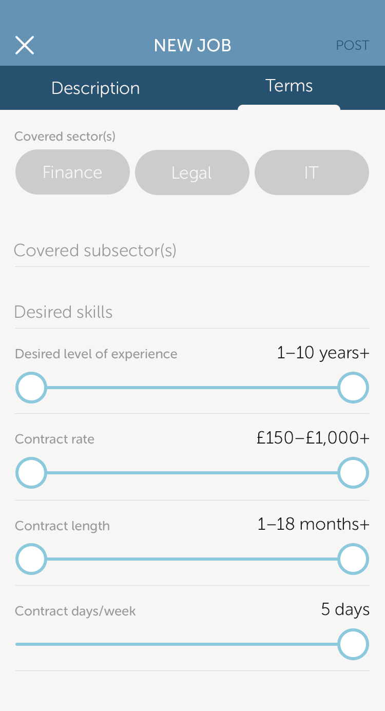
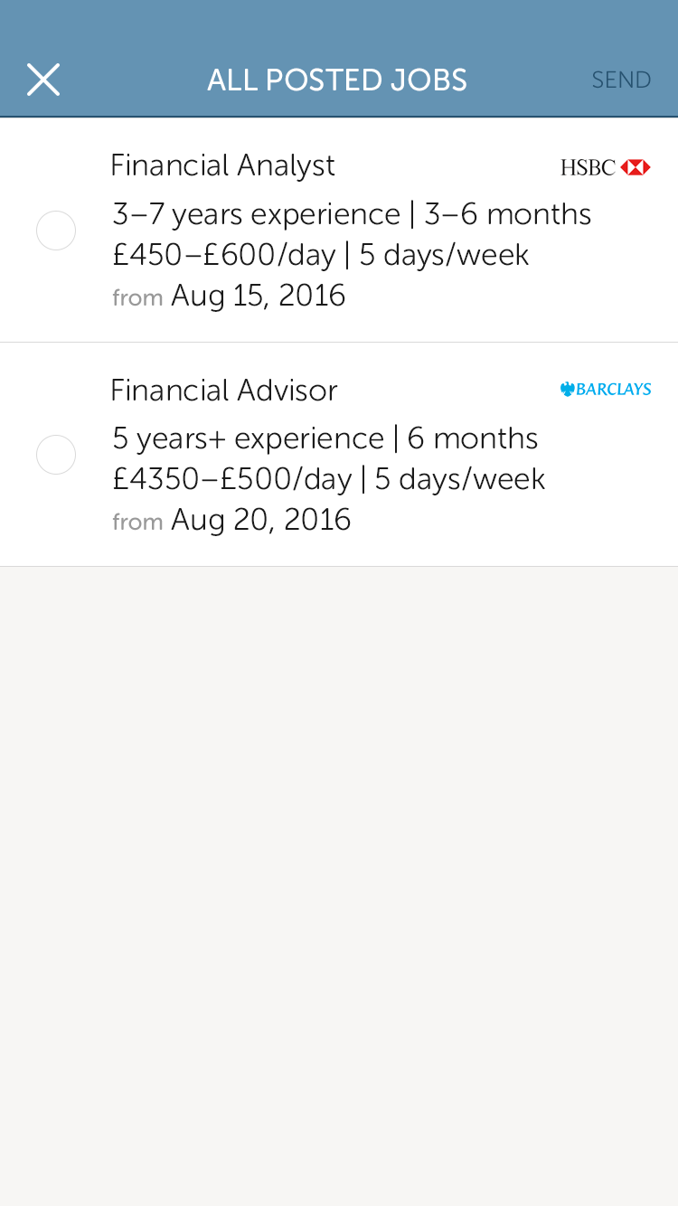
Once set up, the recruiter/recruiting company is prompted to post their first job. The New Job modal view is made up of 2 sections; Description and Terms.
Once set up, the recruiter/recruiting company is prompted to post their first job. The New Job modal view is made up of 2 sections; Description and Terms. Given that the Description section could be quite lengthy at times and would be better to do on a desktop, we envisioned this section being used either for on the run descriptions (adding more to it once the recruiter gets on a computer) or for shorter descriptions of certain jobs.
Given that the Description section could be quite lengthy at times, we envisioned this section being used either for on the run descriptions (adding more to it once the recruiter gets on a computer).
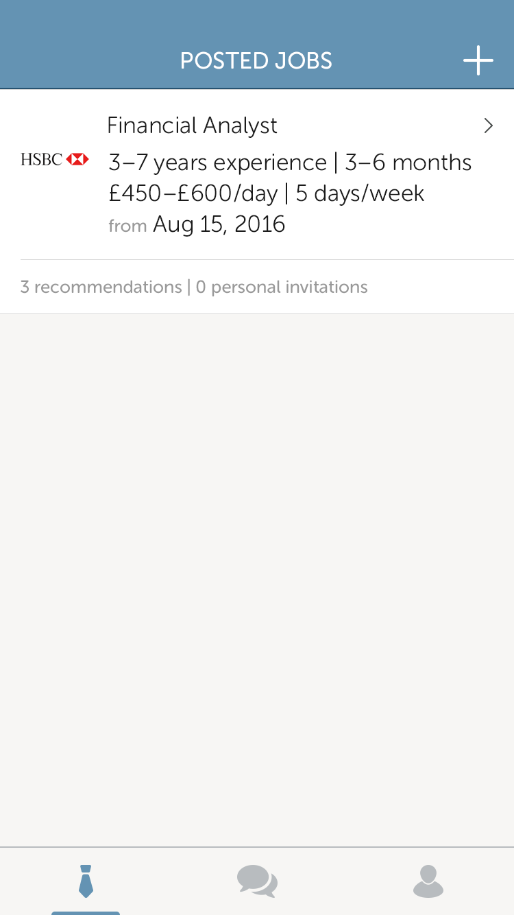
The Terms section mirrors the first step of the contractor profile setup. Once this section is filled in, the filtering of the right candidates happens. That way, once the jos is posted, the recruiter can already see how many recommended candidates the app gives them. The recruiter can then actively look through these recommendations and send personal invitations to candidates to apply for that specific job.
Profiles
Profiles
On first arrival on their profile screen, the candidate will only have the information they input in the profile setup process.
In order to strengthen their profile, we forced a to-do list above the fold and a profile strength progress bar. This list would appear until some information was input in the sections mentioned in it. The idea is that the more detailed the profile is, the higher the chances are of finding the right job.
Unlike the contractor, a recruiter doesn't have a lot on their to-do list. If they're part of a company, it's more important to update the company information that will appear on their profile. Once they do that, it's up to the admin (the person who set up the account) to approve changes on the company profile and team profile.
On first arrival on their profile screen, the candidate will only have the information they input in the profile setup process.
In order to strengthen their profile, we forced a to-do list above the fold and a profile strength progress bar. This list would appear until some information was input in the sections mentioned in it. The idea is that the more detailed the profile is, the higher the chances are of finding the right job.
Searching for jobs
Searching for jobs
The client was very keen on using the same interaction as on Tinder. They wanted something so the job postings would stand out, so lists were out of the question.
The client was very keen on using the same interaction as on Tinder. They wanted something so the job postings would stand out, so lists were out of the question.
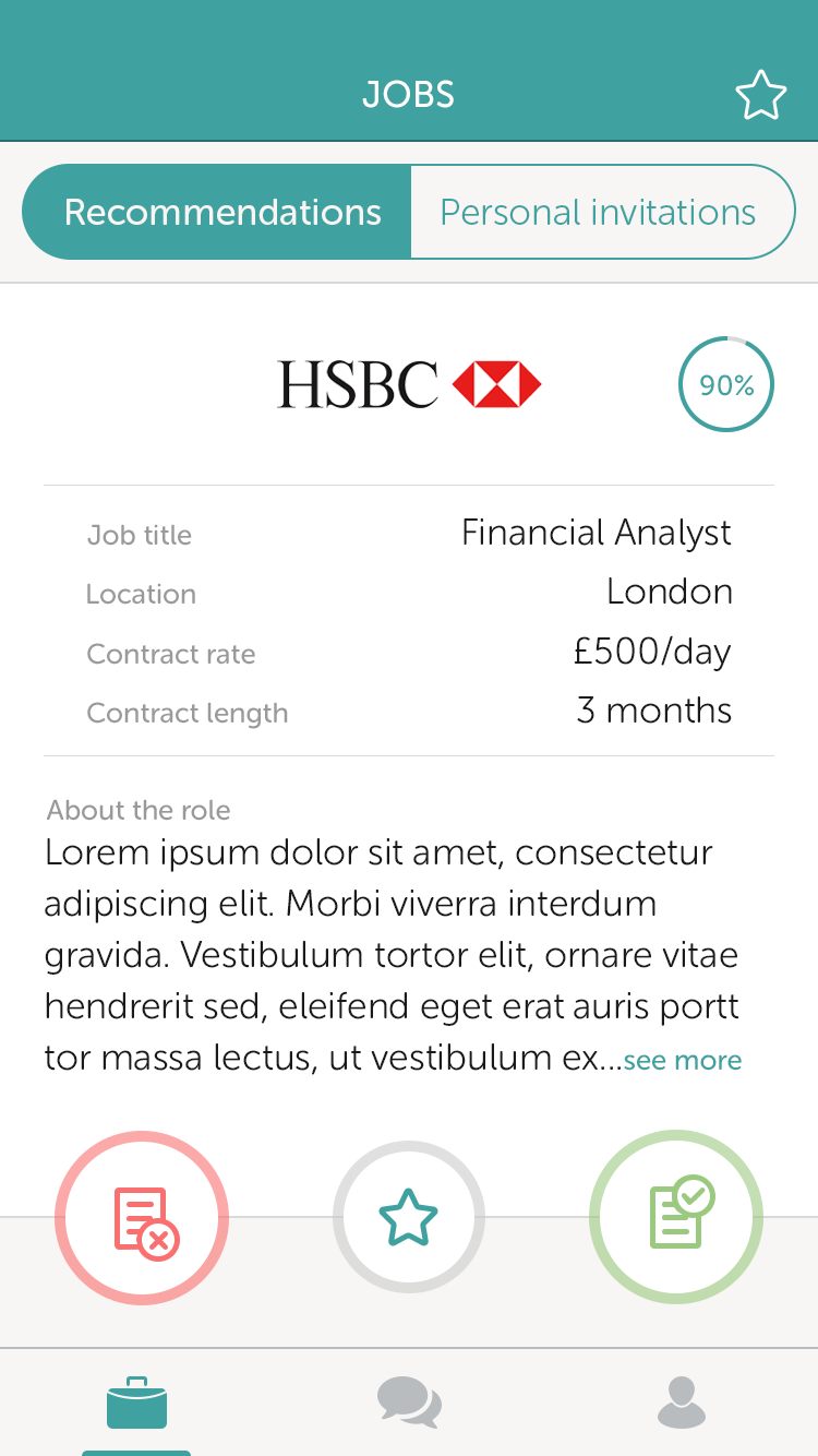
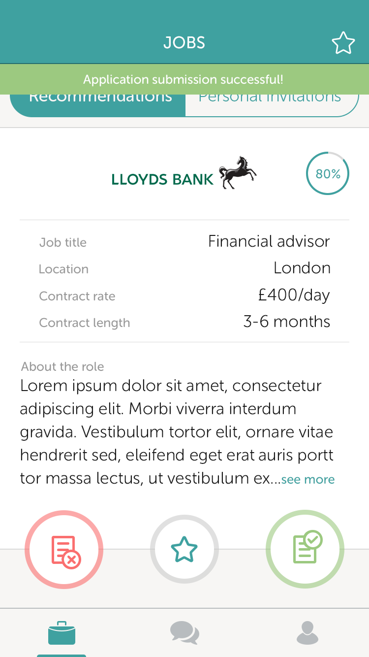
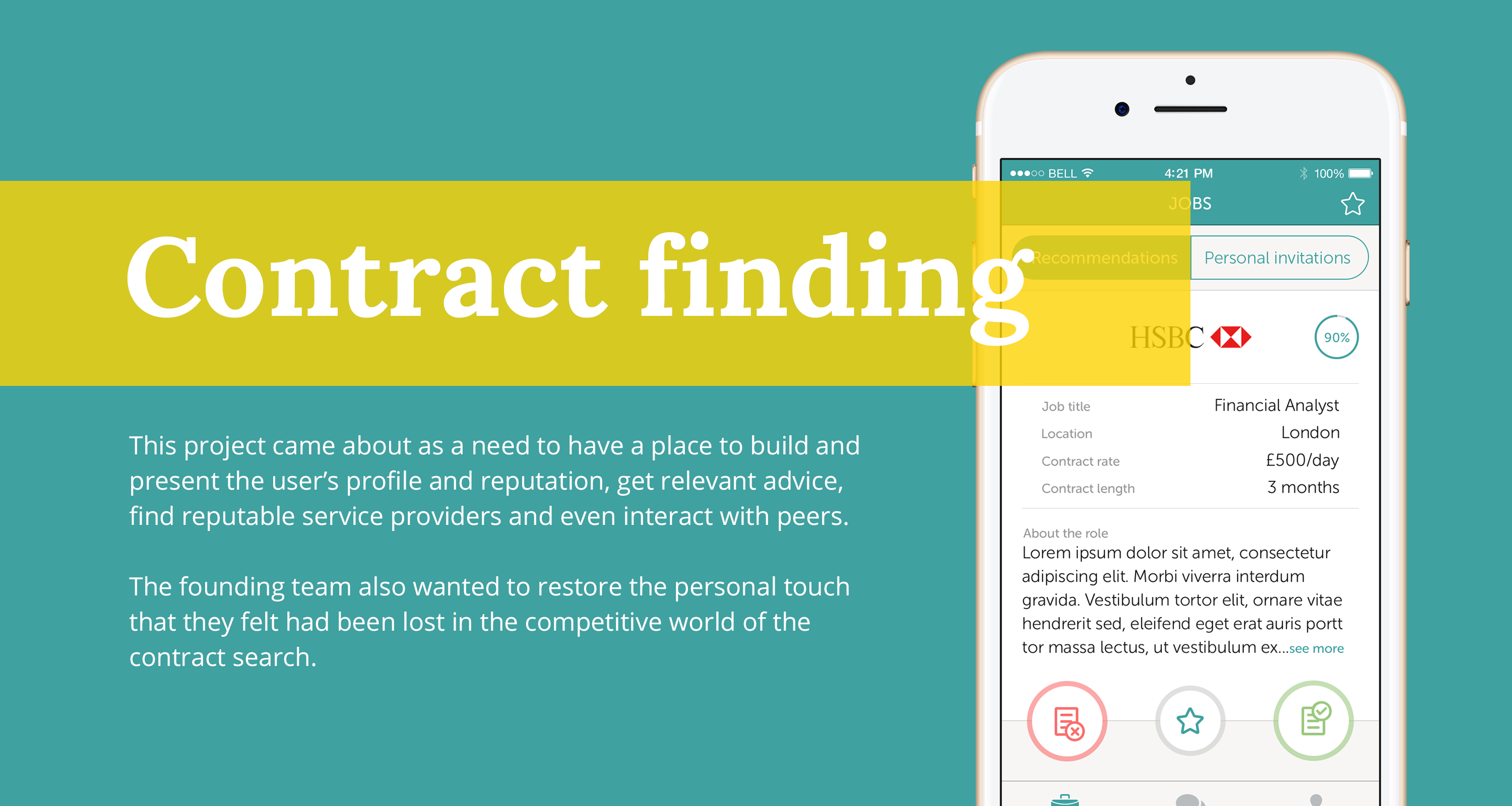
Each job card would show the esential information first (title, location, money and duration) and a compatibility % that's based on the contractor's profile. That's why we had to force the to-do list on their profile page.
Each job card would show the esential information first (title, location, money and duration) and a compatibility % that's based on the contractor's profile. That's why we had to force the to-do list on their profile page.
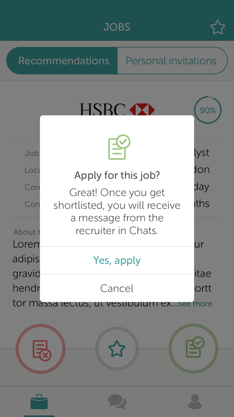
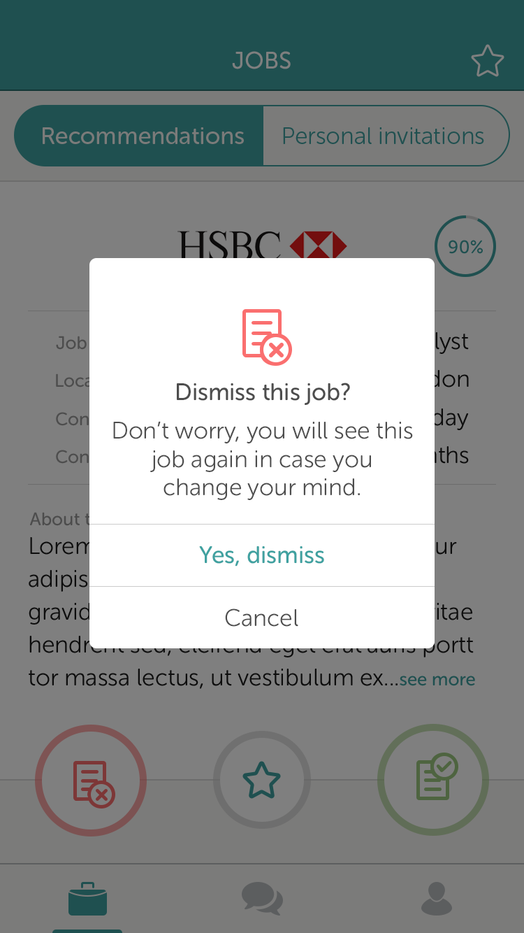
Applying to a job is a 2 tap process: hitting 'Apply' and agreeing to being contacted by a recruiter in case the contractor gets shortlisted. Unlike Tinder though, dismissing a job didn't mean the contractor wouldn't see the job again while swiping left and right.
The candidate could also favourite any job in case they wanted to read more about it on a larger screen.
Searching for candidates
Searching for candidates
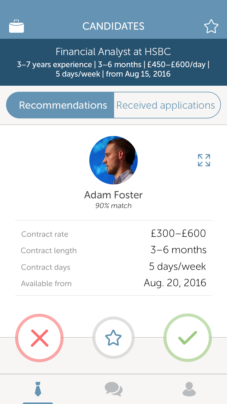
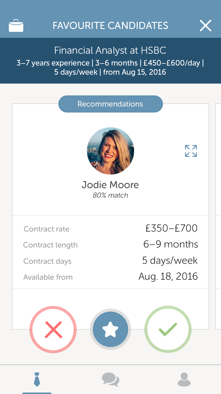
For the recruiter, the format for searching candidates is the same as the candidate's job hunting section. Still Tinder based.
Once the recruiter finds a contractor, they can either invite them to apply or they dismiss them for the job.
For the recruiter, the format for searching candidates is the same as the candidate's job hunting section. Still Tinder based.
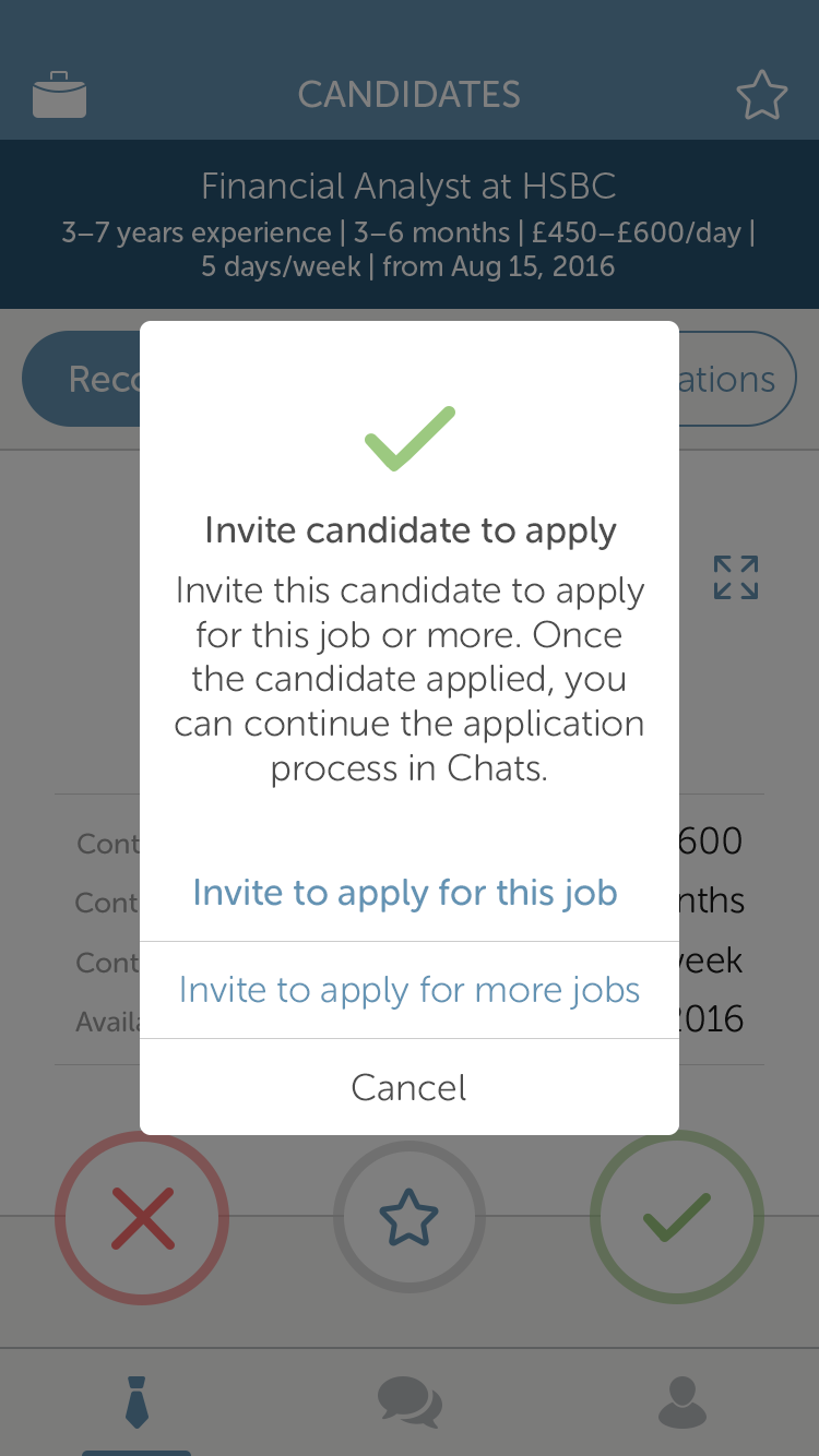
Once the recruiter finds a contractor, they can either invite them to apply or they dismiss them for the job. If the contractor is to their liking, they can invite them to apply for that job or a different one they might think would be a better fit.
If the contractor is to their liking, they can invite them to apply for that job or a different one they might think would be a better fit.
As candidates can do with their jobs, recruiters can favourite candidates. Within the favourite section they will see contractors who both were recommended by the system for a job and have applied for that same job.
From phone interview to getting the job
From phone interview to getting the job
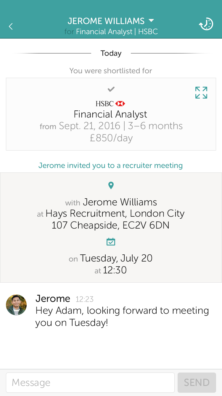
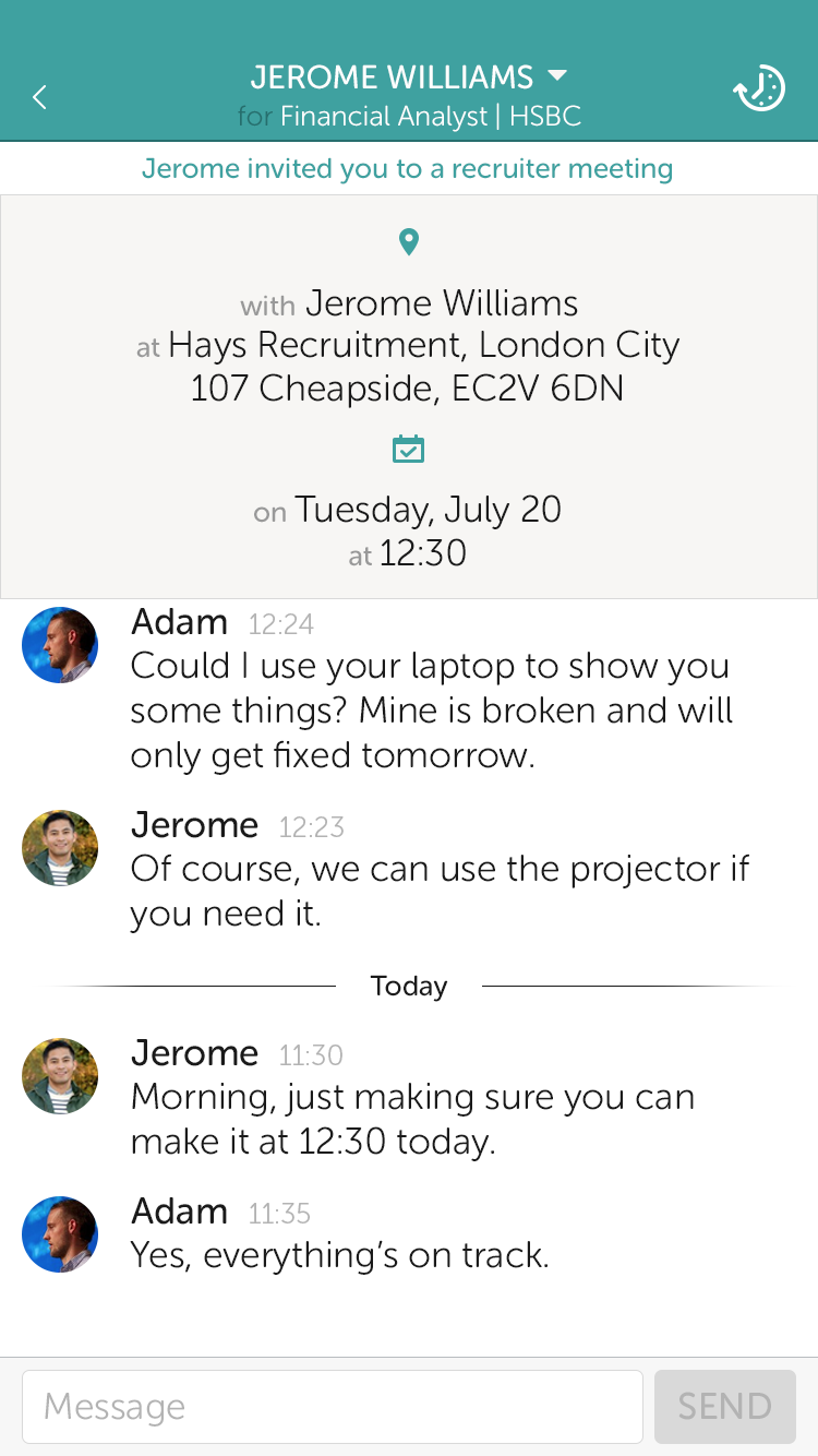
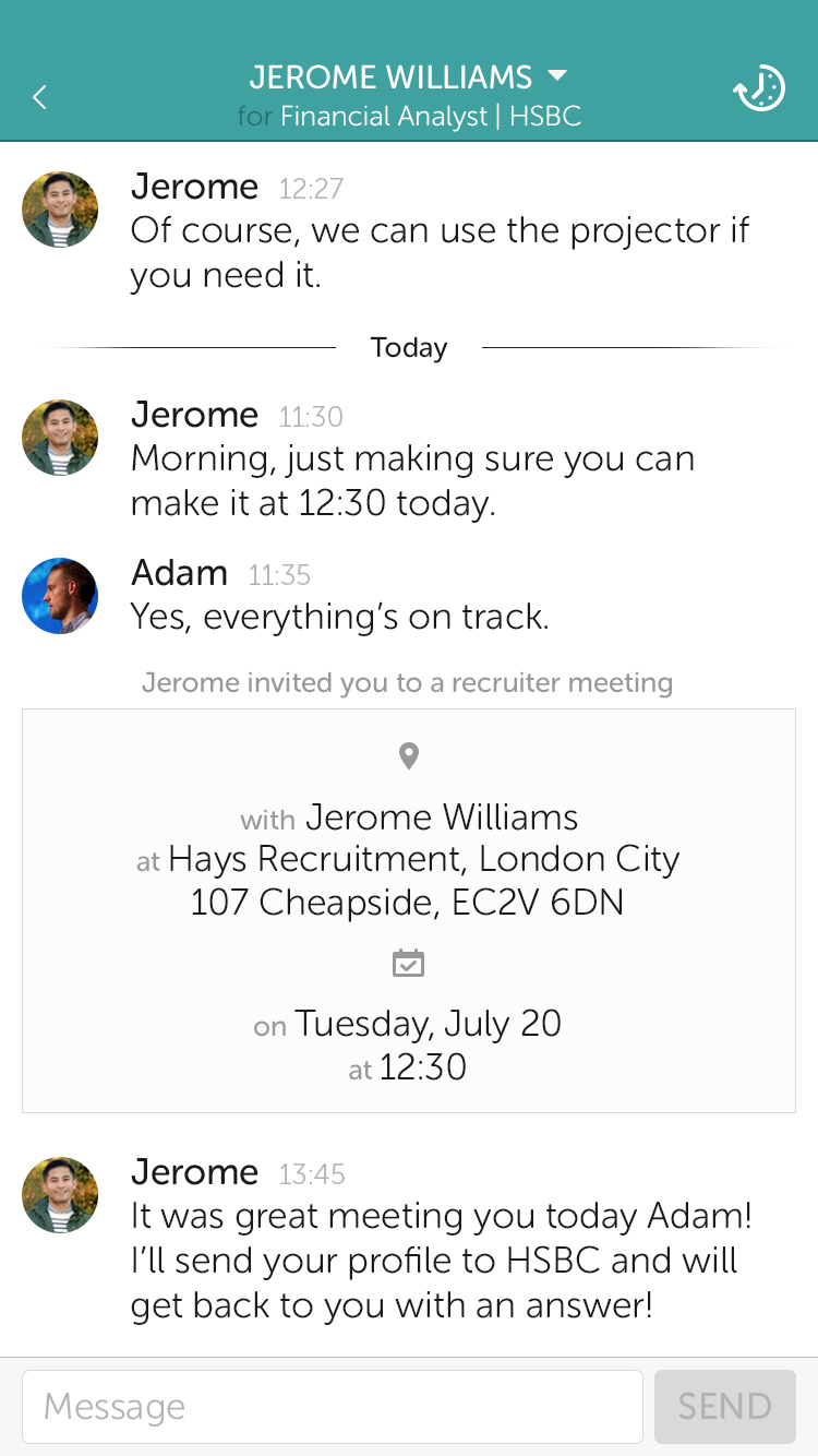
Each step in the application process is presented on a card. This card holds the neccessary information for a meeting, phone or face to face. The card will be sticky on the screen until the date and time on it passes; after that it becomes part of the conversation thread.
Each step in the application process is presented on a card. This card holds the neccessary information for a meeting, phone or face to face. The card will be sticky on the screen until the date and time on it passes; after that it becomes part of the conversation thread.
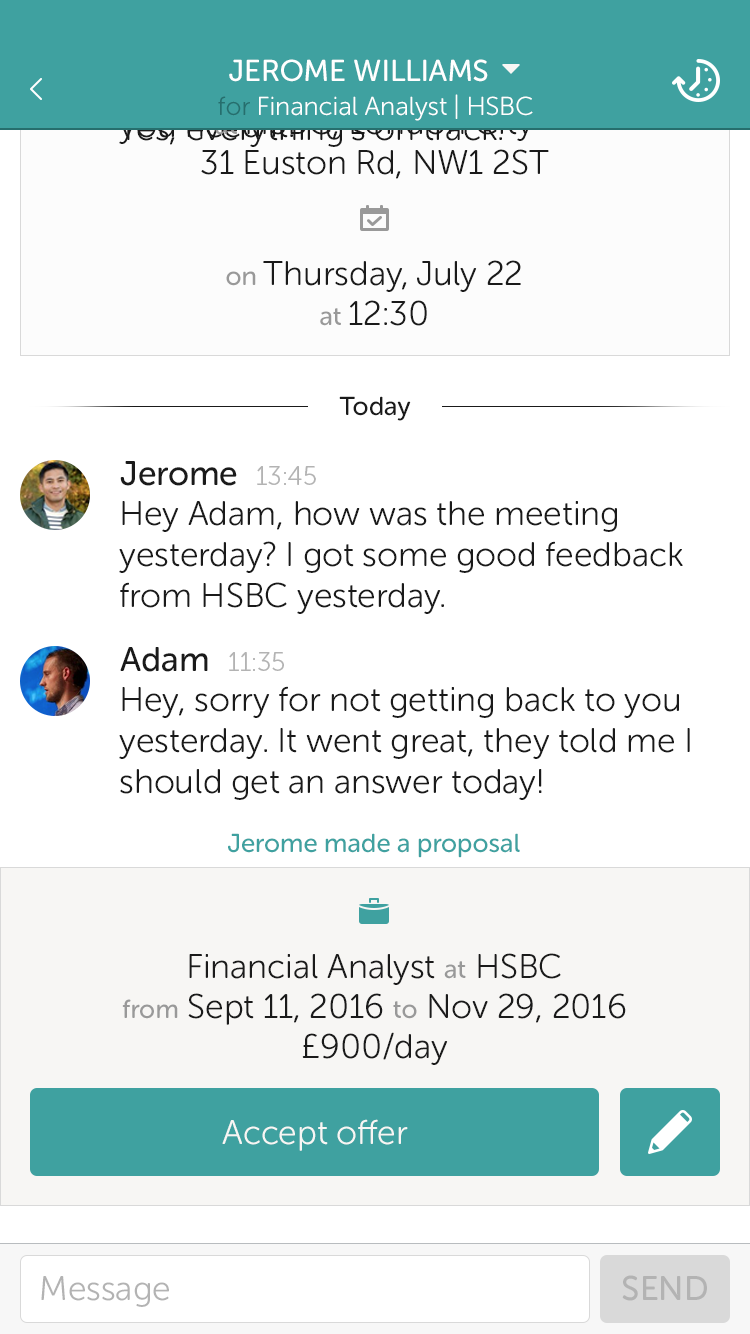
Beside meetings, and if all goes well, the candidate will be sent another card with a proposal that has the minimum neccessary on it: role, start and end dates and rate. This card can be edited by the candidate and then approved (or not) by the recruiter.
Beside meetings, and if all goes well, the candidate will be sent another card with a proposal that has the minimum neccessary on it: role, start and end dates and rate. This card can be edited by the candidate and then approved (or not) by the recruiter.
Final steps
Final steps
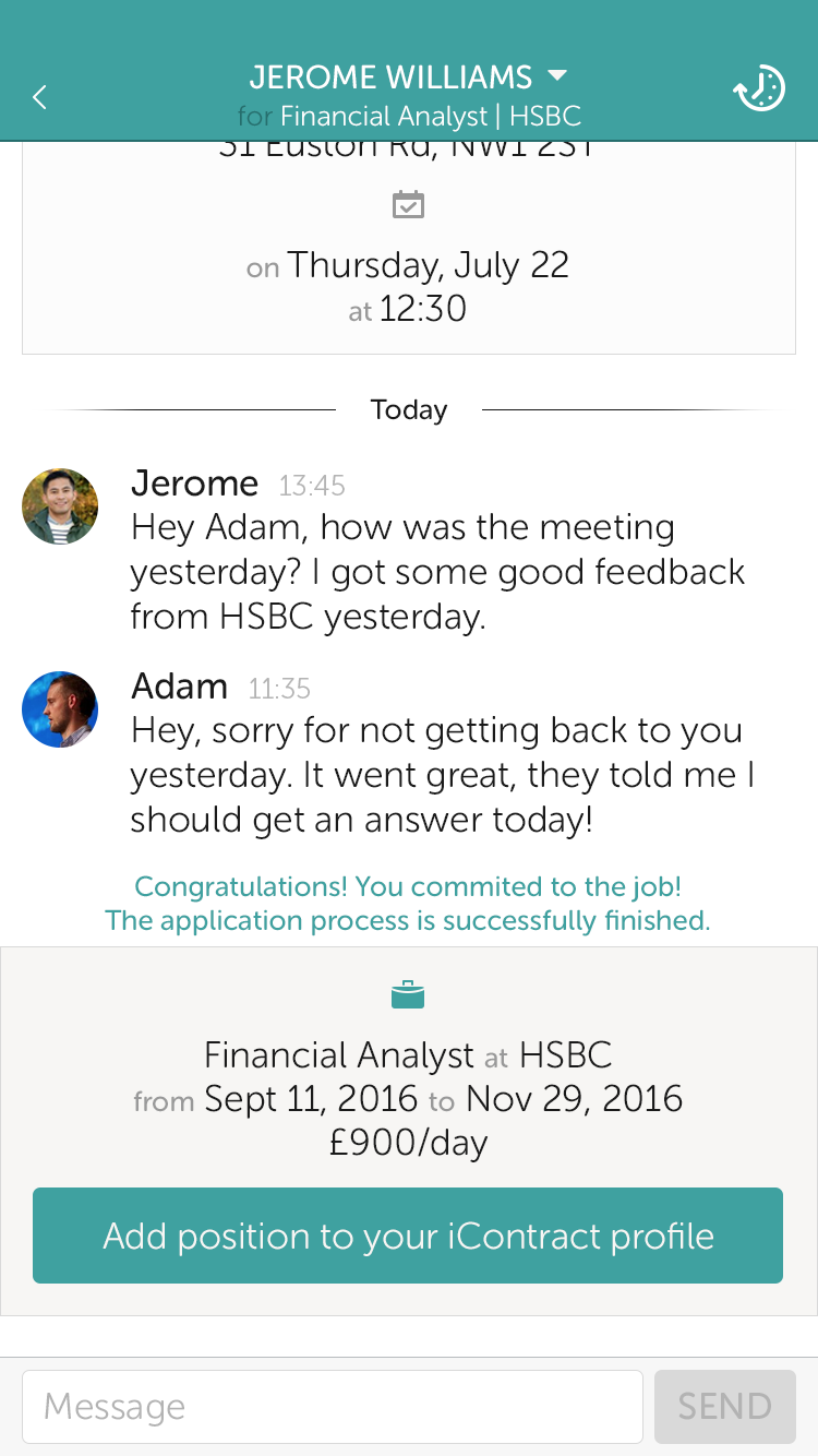
Once the nitty gritty of getting a job is done, the
candidate can add their position to their iContract
profile as easy as tapping a button.
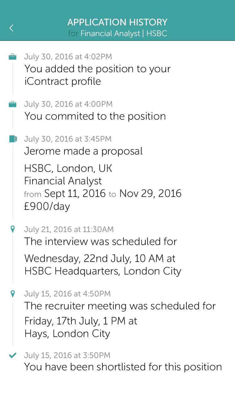
For audit purposes (not really), the candidate and
recruiter can check out the application history side
panel in order to see the steps out of the
messaging context.
Once the nitty gritty of getting a job is done, the candidate can add their position to their iContract profile as easy as tapping a button.
For audit purposes (not really), the candidate and recruiter can check out the application history side panel in order to see the steps out of the messaging context.
Once the nitty gritty of getting a job is done, the
candidate can add their position to their iContract
profile as easy as tapping a button.
For audit purposes (not really), the candidate and
recruiter can check out the application history side
panel in order to see the steps out of the
messaging context.
SOLUTION (WEB)
SOLUTION (WEB)
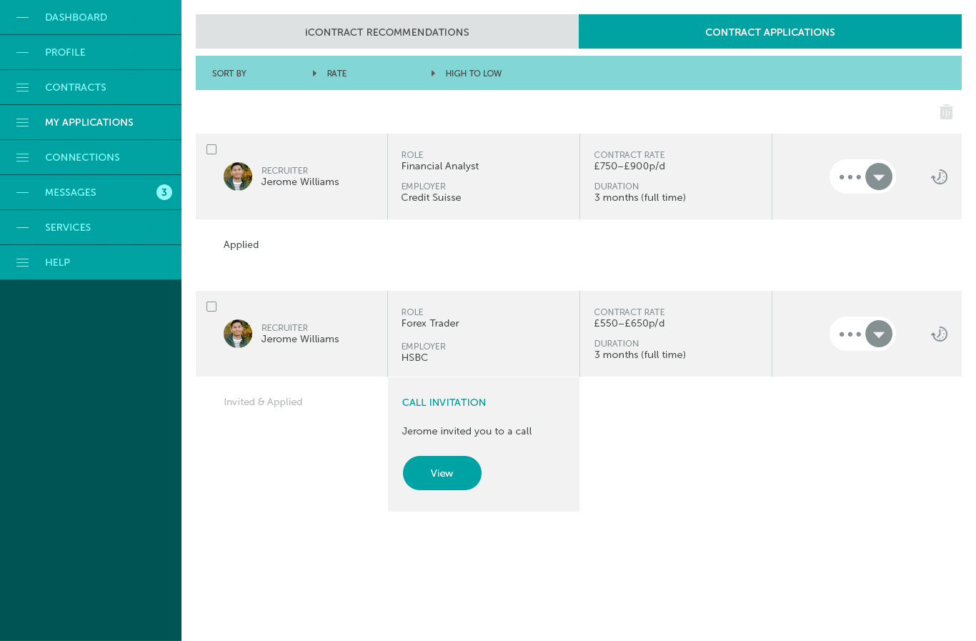
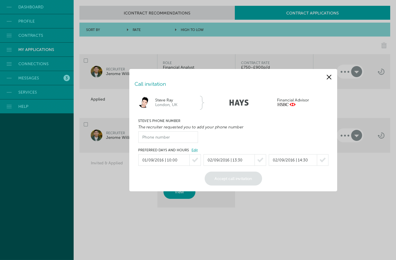
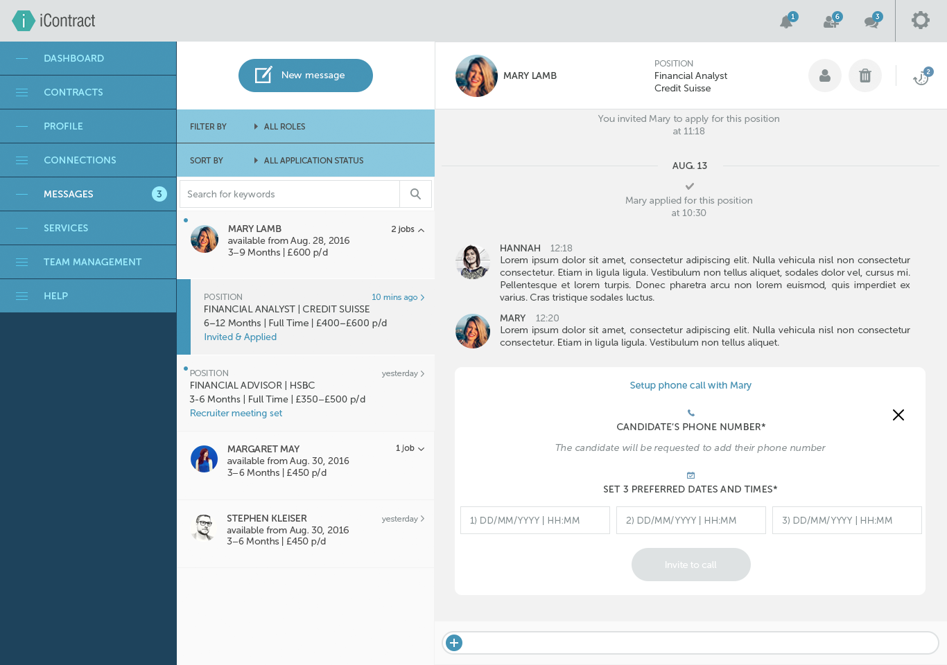
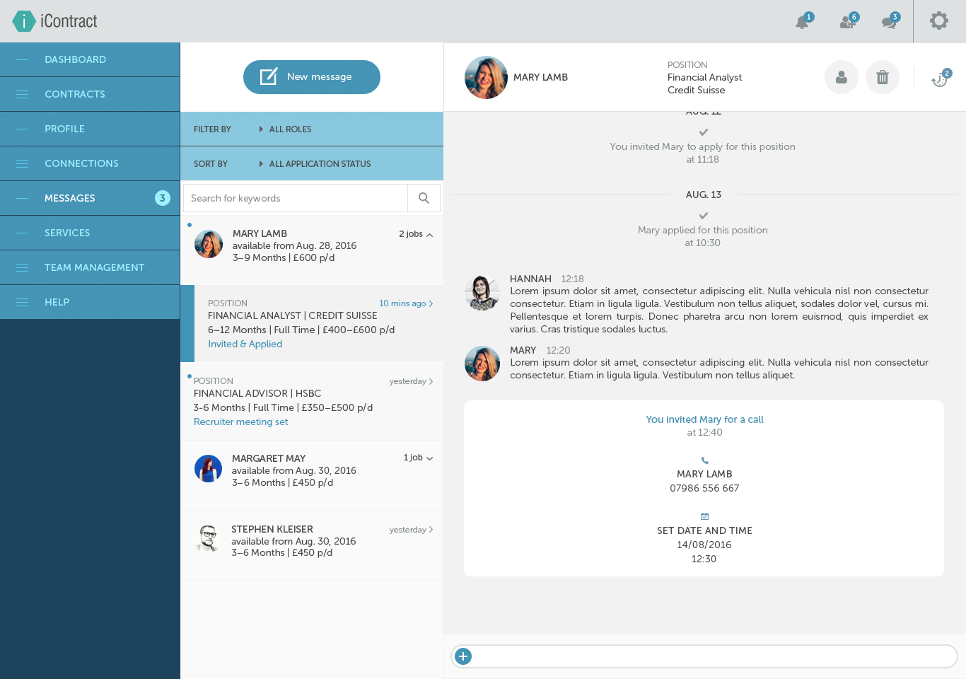
The Messages and My Applications pages were left untouched until the mobile app was finished. That way we could offer a consistent experience on both desktop and phone.
The Messages and My Applications pages were left untouched until the mobile app was finished. That way we could offer a consistent experience on both desktop and phone.
THE TEAM
THE TEAM
Luckily for me, the front-end dev team was the same team from Briqs. Having built a solid relationship, it was far easier for us to know what makes the other one tick.
Luckily for me, the front-end dev team was the same team from Briqs. Having built a solid relationship, it was far easier for us to know what makes the other one tick.
The back-end team, together with the founder and designer, were already an established entity by the time we came in. We would meet once every 2 weeks to get feedback on the direction.
The back-end team, together with the founder and designer, were already an established entity by the time we came in. We would meet once every 2 weeks to get feedback on the direction.
TOOLS USED
TOOLS USED
TAKE A LOOK AT THE OTHER PROJECTS:
All designs presented on this page are © of their respective owners. The contents of this page are intended for your personal viewing and any sharing without my explicit consent is not allowed. Nor nice.
Disclaimer: all designs presented on this page are © of their respective owners.
Please do not share the contents of this page.
It is intended for your personal viewing and any sharing without
my explicit consent is not allowed. Nor nice.
Disclaimer:
All designs presented on this page are © of their respective owners. Please do not share the contents of this page.
It is intended for your personal viewing and any sharing without my explicit consent is not allowed. Nor nice.

